
The Background
The client has an existing website designed for their employees to raise IT incidents. Each of their retail stores has an account where they can raise and track all of the incidents raised for that store.
On the website, there is a page with categories that employees can choose from which lead them to the correct incident form for their issue. Employees sometimes choose an incorrect category which can be a problem for the business and result in the issue taking longer to solve. Based on my prior user research, the reason for stores selecting the wrong category is often due to communication barriers between them and the IT department, as lots of different jargon is used by different stores for the same piece of equipment.
My research also suggested that not many people are using the existing search functionality.
The website also has self-help guides that employees can use to solve their own issues. The client would like to encourage employees to use these guides, to save the business the cost of technicians.
Prior Research
April - June 2023
Initial User Research Interviews
5 participants
January - December 2023 (ongoing)
Optional feedback surveys on the home page of the website and mobile app
244 responses
September 2023
System Usability Scale survey
47 responses
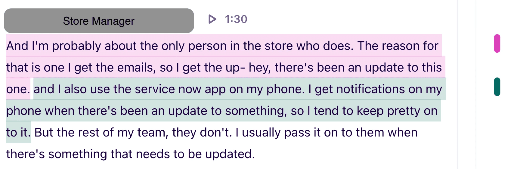
"Need a better search function that contain normal everyday words we used in daily life not technical words"
Assistant Store Manager, SUS Survey, September 2023
"Trying to navigate the menus to log something when you don't know what area to look for can be quite confusing"
Team Leader, SUS Survey, September 2023
The Brief
The client wants to improve their search bar by using an AI implementation. They believe that this will help employees to reach the correct incident form, as well as encourage users to use the search bar.
The client also wishes to scale the website in the future to handle many more categories / tiles, and believes a search would be more beneficial at that point.
To address the user concerns, the search needs to be redesigned to be more clear and easy to use.
Initial Designs
Research questions
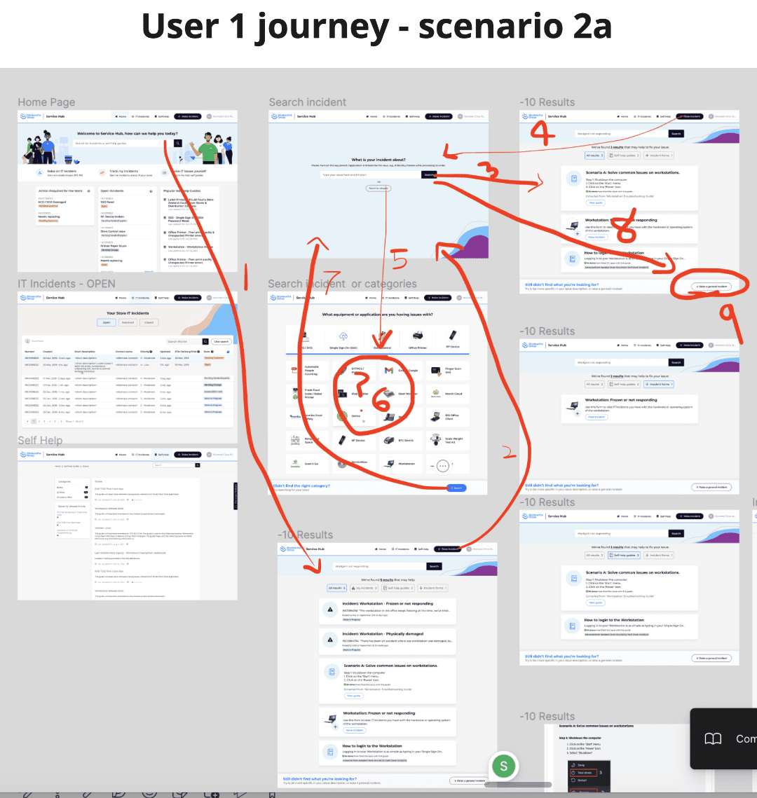
Can users navigate the search results successfully?
Can users distinguish between the different types of results (incident forms, active incidents, and self help guides)?
If there is no existing category for the users' issue, can they still find where to go?
Do users use the self-help guides?
Research goal
The goal of this study is to assess the usability of the new AI search flow, and uncover user's search habits.
Participants
Round 1
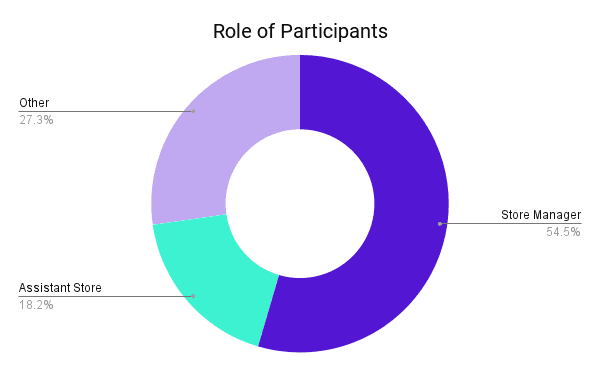
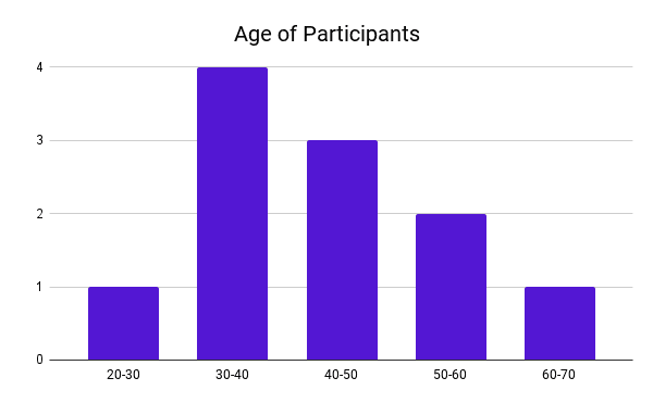
Store Manager, Male, 40-50, NZ
Store Manager, Female, 30-40, TAS
Store Manager, Male, 30-40, VIC
Assistant Store Manager, Female, 40-50, QLD
Round 2
Team Leader, Male, 50-60, NSW
Customer Service Leader, Female, 60-70, NZ
Store Manager, Male, 50-60, VIC
Round 3
Assistant Store Manager, Male, 30-40, NSW
Team Leader, Male, 20-30, SA
Store Manager, Male, 30-40, WA
Store Manager, Female, 40-50, WA
Methodology
This testing took the form of a moderated usability study over a video conference call.
I directed them through 3 scenarios (three different types of hardware/software being damaged), and observed their process while encouraging them to think aloud.
Following this, there was an opportunity for them to provide general feedback on the whole app / website.
Location: Online, Australia and New Zealand
KPIs: Time on Task, Click analysis, verbal feedback
Date:
Round 1: 18-27 September
Round 2: 11-17 October
Round 3: 18 October - 1 November
Statistics on Participants (to avoid bias)


Usability Testing Script
1
Individual introductions
Each person introduce themselves
Confirm their role and store
2
Explanation of a usability study
Explain the purpose
We’ve had feedback that people aren’t using the search bar, or are finding it difficult to search with it. We’re planning to update the search in terms of accuracy, but also in terms of usability. That’s where we need your help.
Explain the format
We’ve made a design for how this would work, and we want you to test it out.
We give you a link, and you would share your screen.
We’ll give you some scenarios, and see how you go through them. It would be helpful if you could talk us through what you’re thinking as you’re navigating.
If things get difficult or confusing, that’s okay, that’s what we’re trying to figure out before we release this to everyone. It’s not a test, we just want to know all the good and bad things you’re thinking about while going through the website.
Explain prototypes
Also it’s important to note that it’s not a real website, it’s a set of screens that we’ve designed for testing. All you need to do is click or tap through the screens. If something doesn’t respond, don’t worry - it just means it’s not clickable.
Explain our role (silent)
The last thing to know is that we won’t be saying anything as you go through the tasks, we won’t answer any questions relating to what you need to do next. Feel free to ask questions as a way of voicing your thoughts, but know that unless you’re really struggling, it will be as if we’re not here.
3
Privacy and permissions
Assure them that the content is confidential and only shared within our group (no negative repercussions to them, so please be honest).
Ask for permission to record the meeting and take photo/screenshots.
4
Tasks
1. Your EFTPOS machine is not working
2. The time-logging application is not responding
3. The time-logging application is not responding (alternate flow)


Results and Iterations
Round 1
Users found it frustrating to be forced to search, and did not see the "Search by categories" button
Users did not see the bottom bar to "Raise a general incident"
Updates
Made it optional to use search, and gave users the ability to search by category immediately
Made the "Raise a general incident" much more prominent and updated the wording to what users are used to: "Raise Other Incident". Also added the icon for "Other Incident" that users see in the categories page.
Round 2:
Users were confused by the different sections in the search results
Users still didn't see the "Raise Other Incident" button
Users didn't use the filters
Updates:
Used a 3 column layout of search results to make the sections more clear
Made "Other Incident" a permanent result on the page in the same format as in the categories page so users understand and see it more clearly
Removed the filters
Round 3:
Users understood this layout better and did not get lost when looking for their incidents
This way, they also understood the different sections
By making Self Help guides into it's own section, it encouraged users to use the guides when they wouldn't have noticed them before
This was therefore used as the final design.
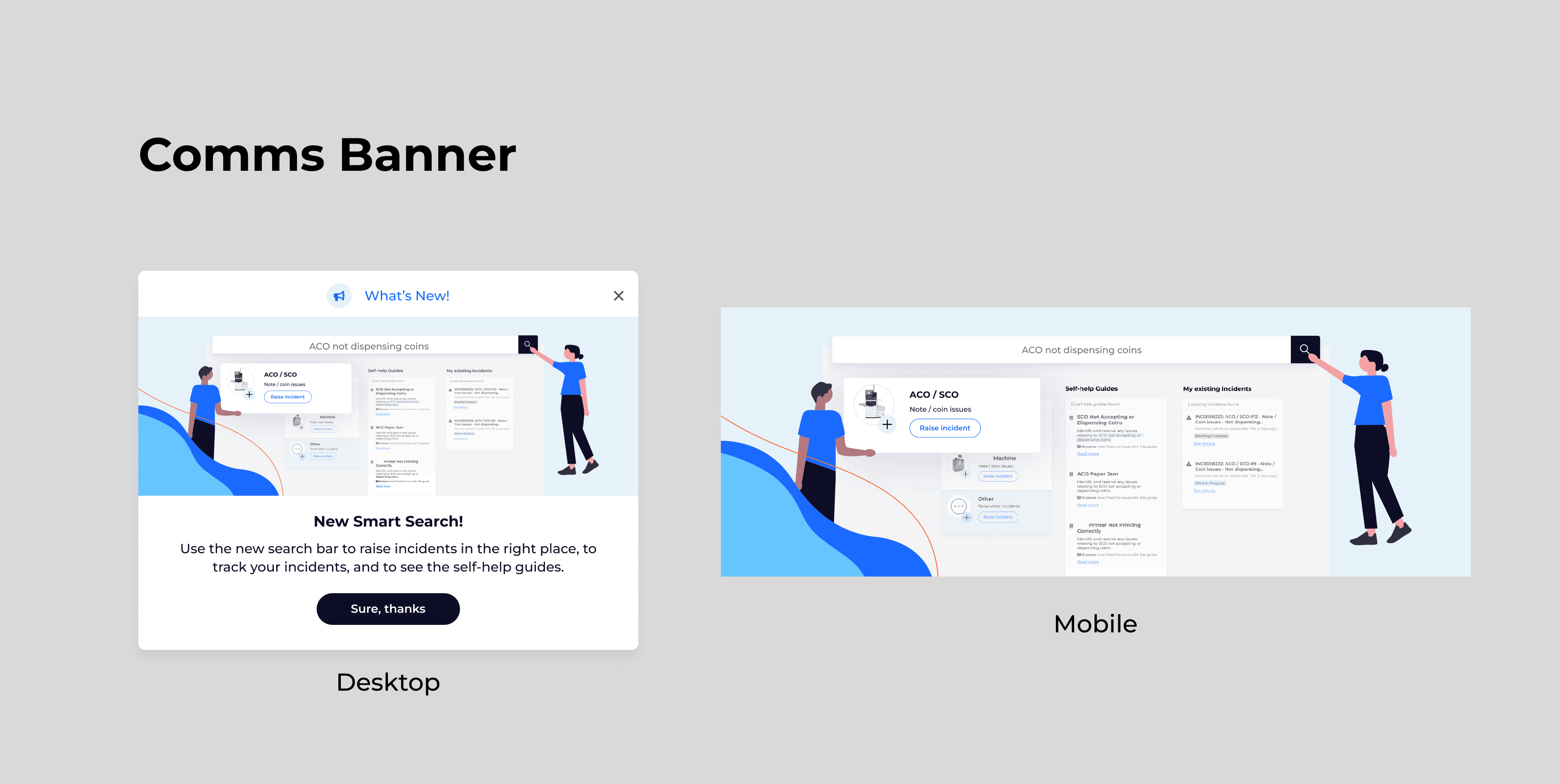
Final Designs
Static

My Key Takeaways
Gained experience designing AI-powered search experiences tailored to real user pain points
Reinforced the importance of aligning language and terminology between users and technical teams to improve usability
Strengthened research and testing skills by validating design decisions through usability testing and iterative improvements
Developed an understanding of how scalable design supports future expansion without overwhelming users
Translated complex business goals into intuitive search interactions that reduce error and improve efficiency

