The Background
The client had previously created a design system, which they use for their digital product. However, due to time constraints, the design system was not fully researched and documented, in terms of best practices, when to use each component, and accessibility concerns. The design system is centered around Form design due to the nature of the product.
Research on Accessibility and Form Design
I completed preliminary research into best practices and the latest studies in Form design and Accessibility.
Adding focus and hover states for accessibility
Increasing the surface area of selectable components for people with fine motor disabilities
Maximum amount of items in radio buttons and checkboxes
Consistency in form headings, subheadings and labels
When and where to display help information and tooltips
Minimising the number of mandatory fields required
Ensuring accessibility using keyboard navigation
Progressive disclosure for complex forms
Using conversational language vs minimal text
Grouping form fields into sections to reduce cognitive load
Ensuring WCAG guidelines are met for colour contrast, size, instructions and the aforementioned points.
The Brief
Make the Design System more robust and informative, while enhancing components to meet Accessibility Criteria, to ensure that the forms are accessible for all and provide an elevated user experience.
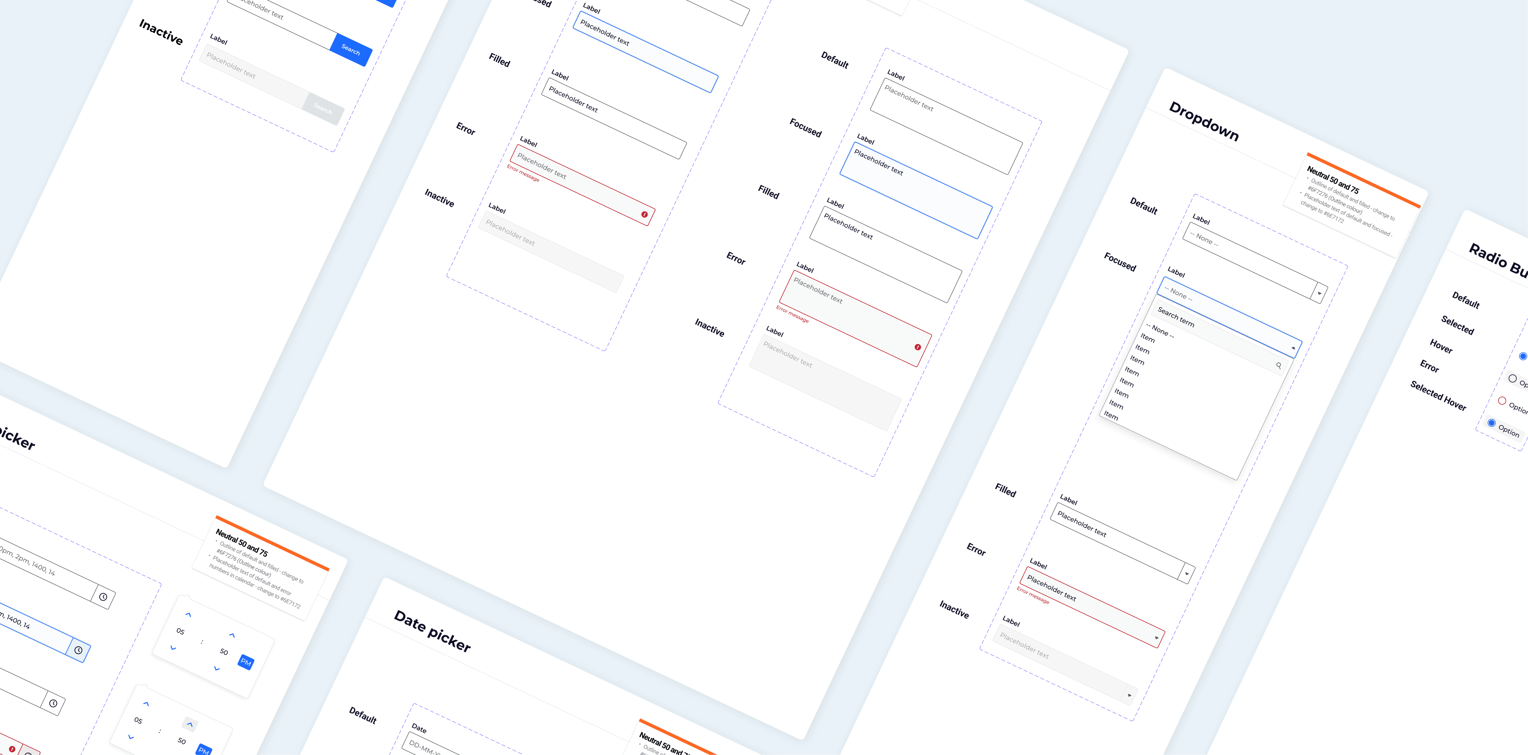
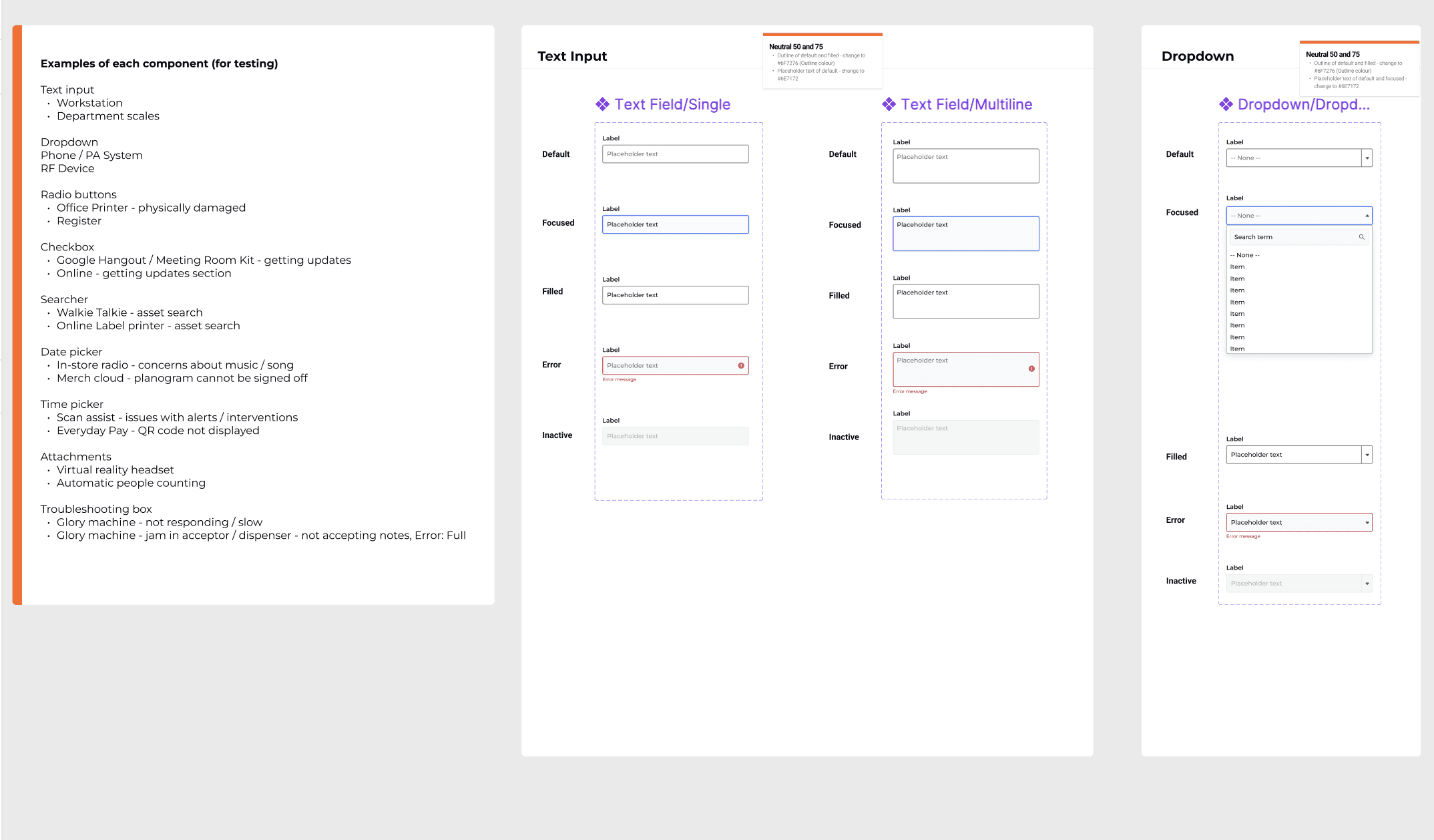
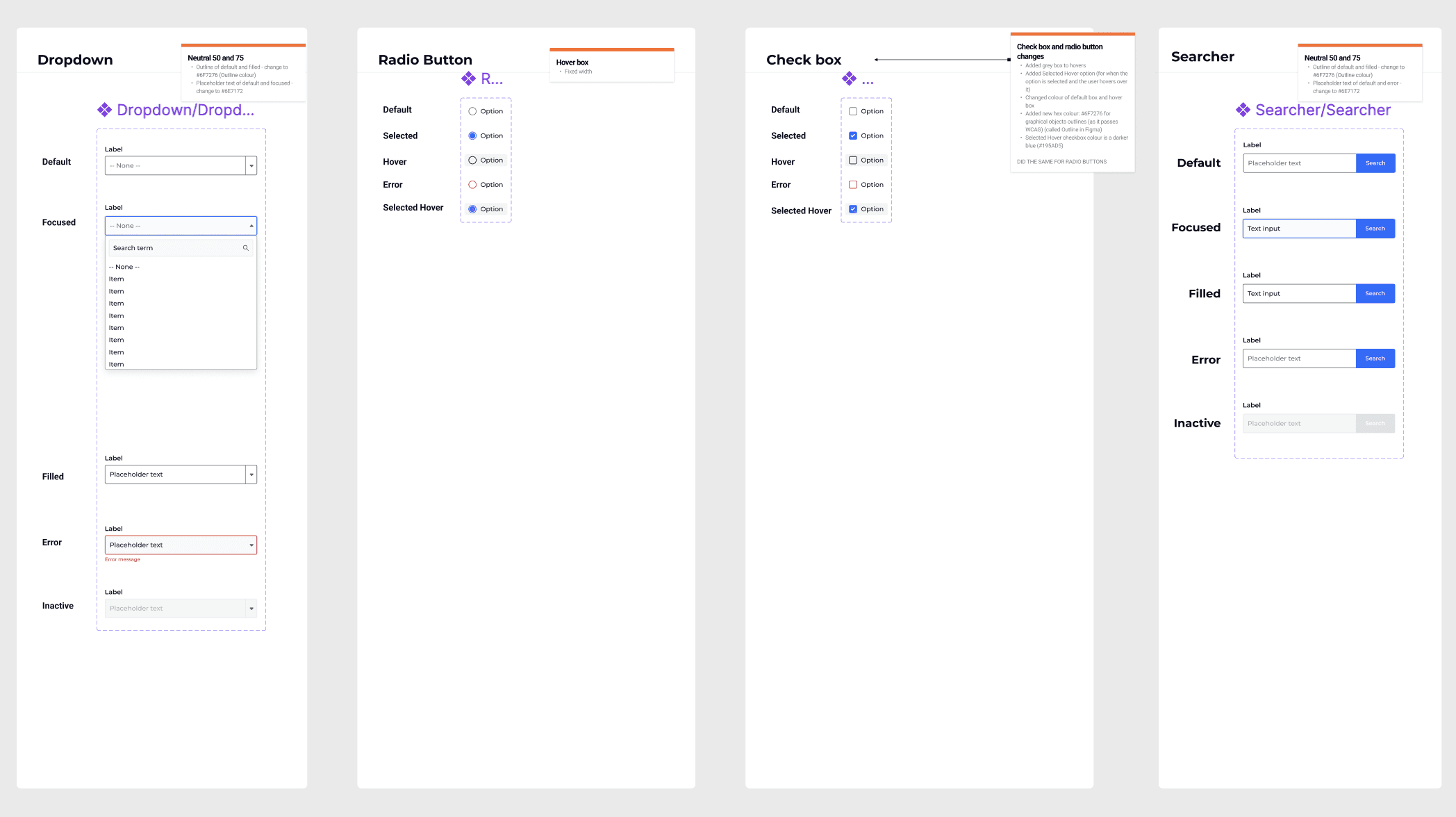
The Audit & Uplift
Updates we made to the components included:
Colour changes of outline and placeholder text to increase contrast for visually impaired users
Adding selected hover states to radio buttons and checkboxes
Instructing the developers in keyboard accessibility and ensuring all components of the product are keyboard accessible
Updating hover states to include a coloured background, thereby increasing the surface area for users with fine motor disabilities
Providing examples of each component in the product to assist the QA tester
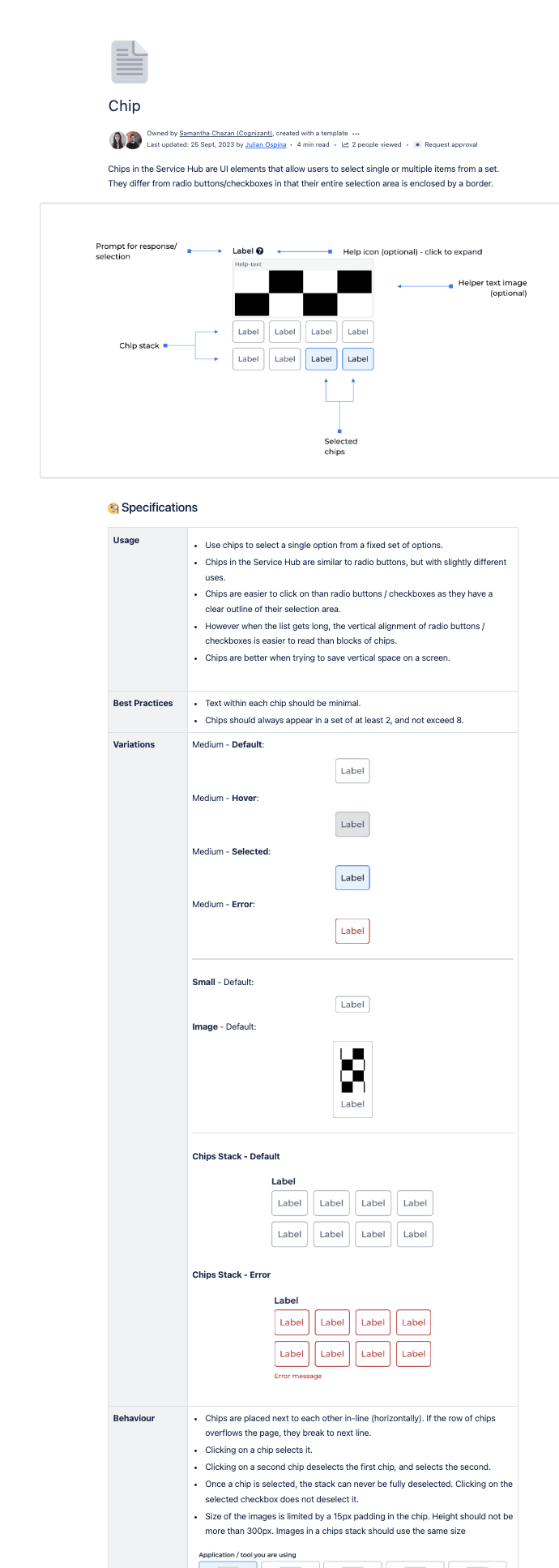
The Guidelines & Documentation
Anatomical Diagram
Specifications
Usage (how and when to use)
Best Practices
Variations (different states, sizes, and device types)
Behaviour (functional behaviour)
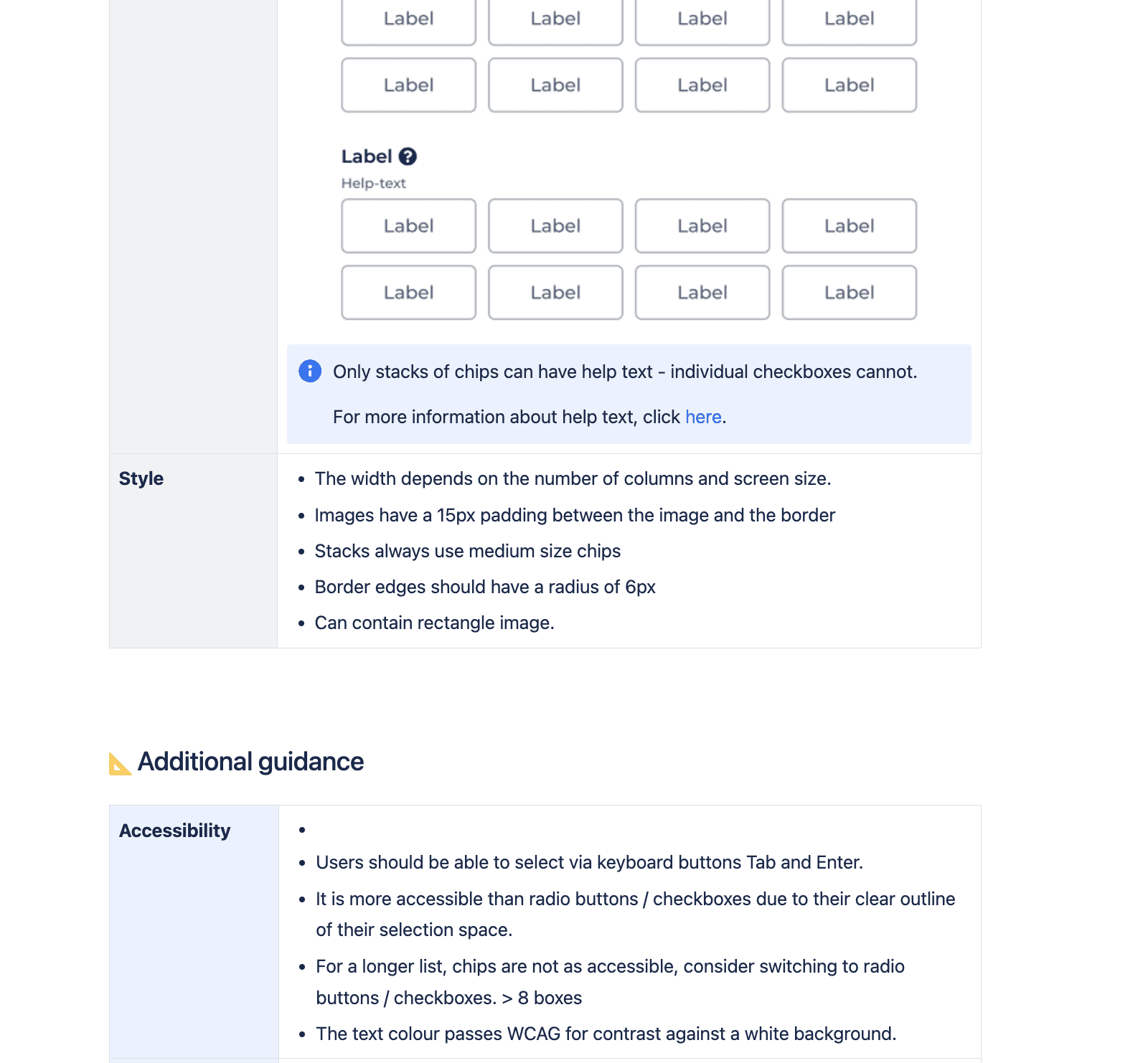
Help Text (when and where to add help text, and variations of help text)
Style (visual style)
Additional Guidance
Accessibility
Mobile specifications
This interactive system ensures the components are being used in the best way, consistent with UX best practices and improving responsiveness and accessibility.
Results

My Key Takeaways
Developed a strong understanding of WCAG guidelines and how to apply them in real-world UI components
Deepened expertise in accessible form design, particularly around usability for users with visual or motor impairments
Learned how to balance accessibility requirements with visual design and product constraints
Strengthened collaboration with developers and QA testers to implement and test accessible, keyboard-navigable components
Improved documentation skills through creating detailed, structured component guidelines that support long-term design consistency and usability
Gained experience in updating and maintaining a design system to support scalability and cross-team usage

